About Project
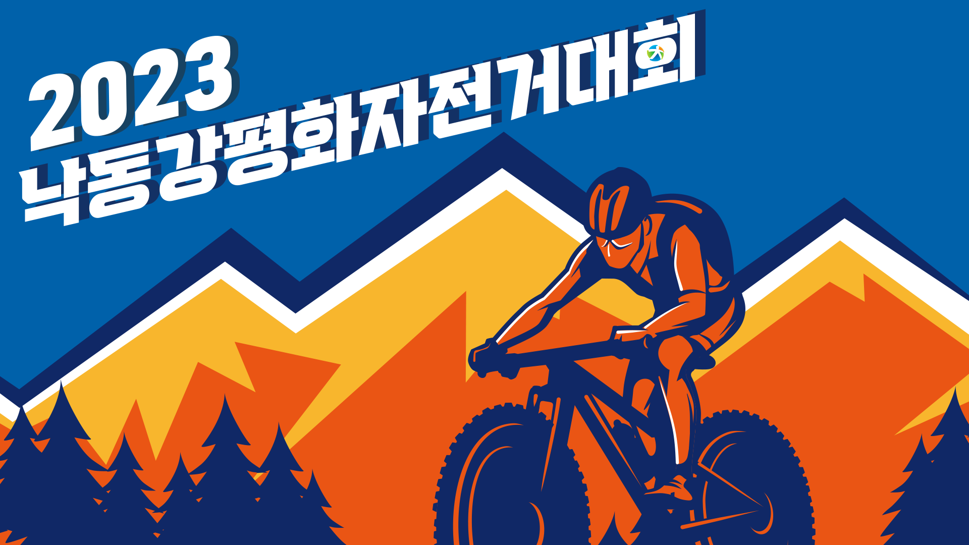
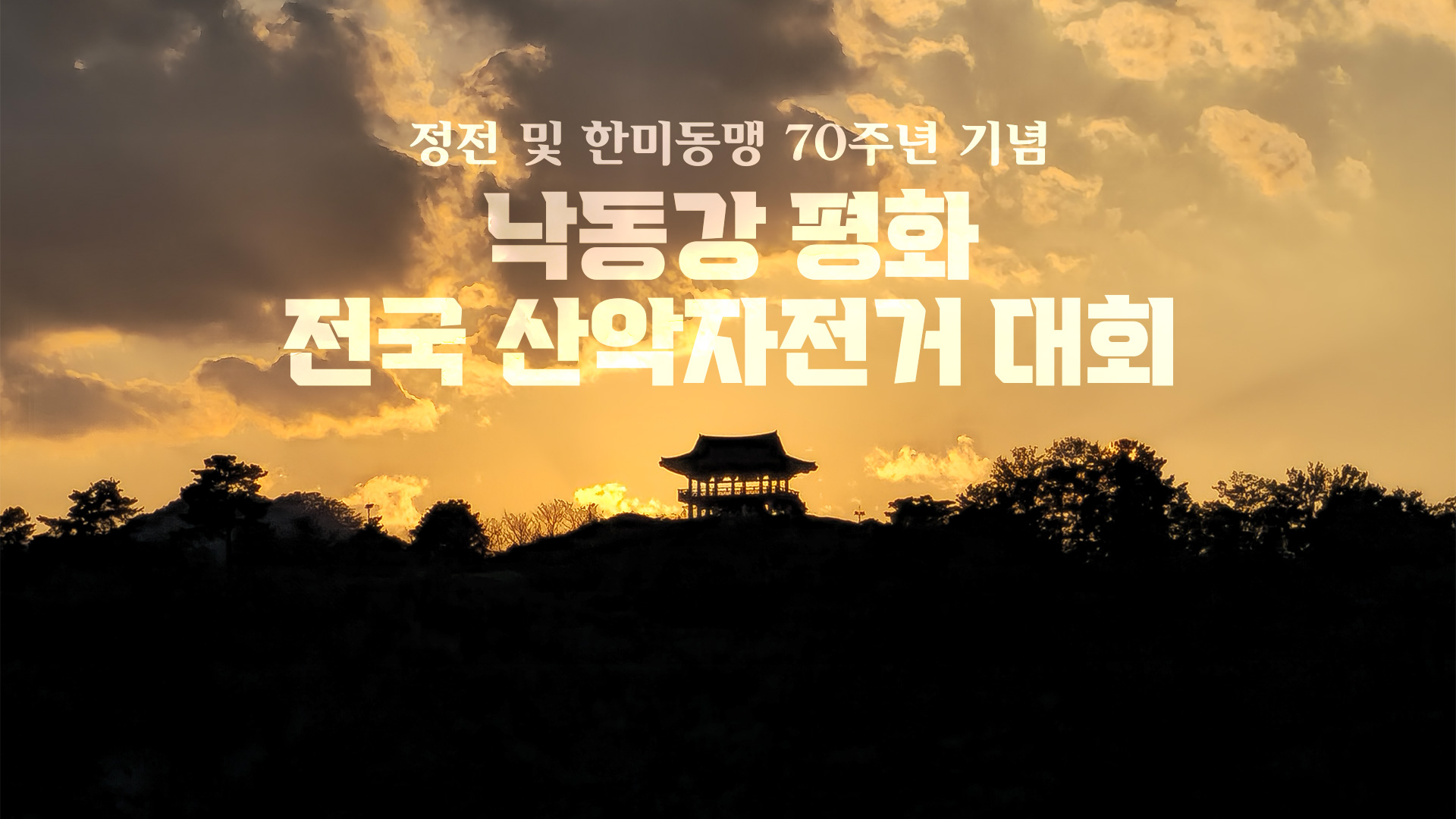
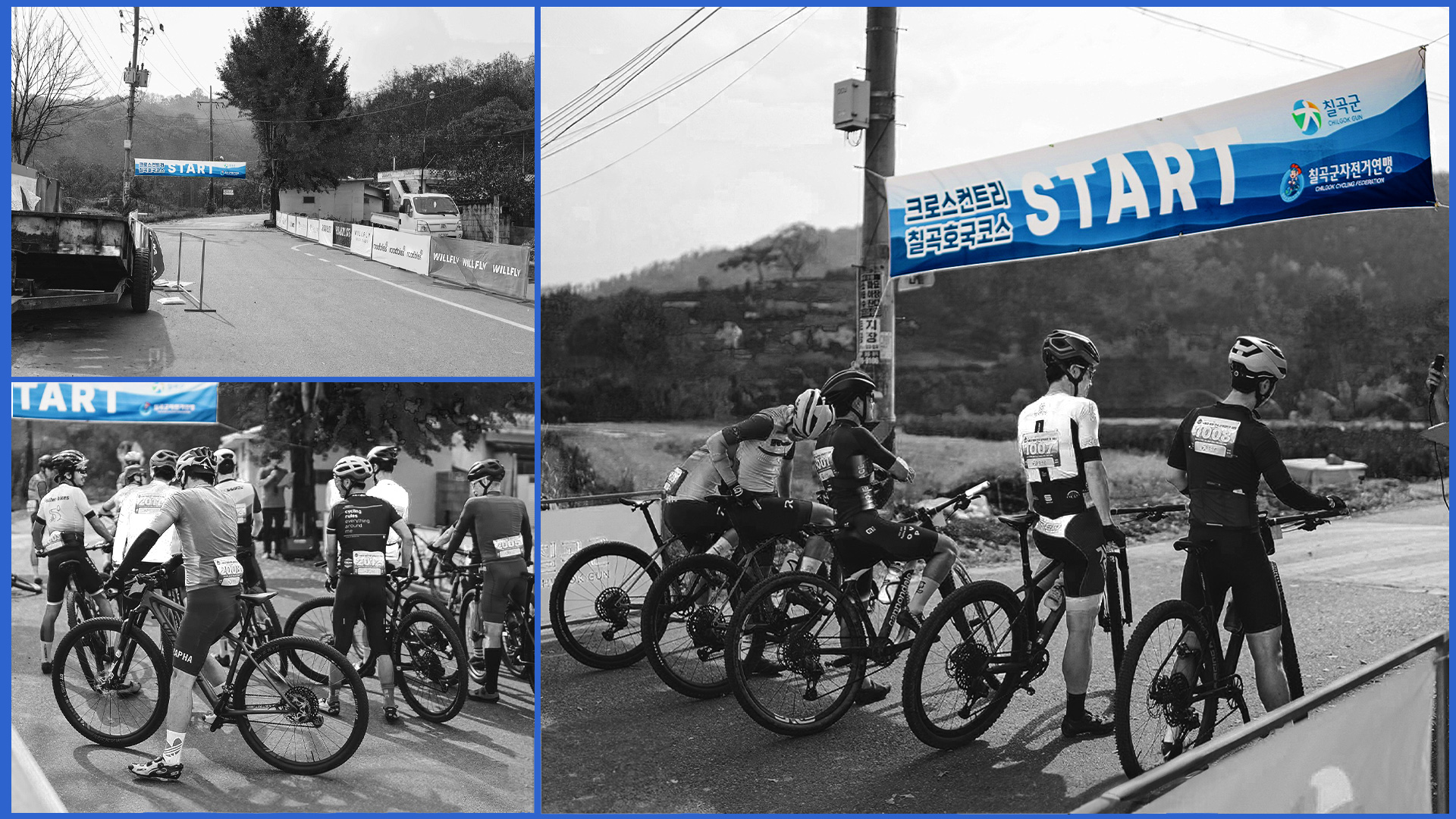
이 프로젝트에서는 정전 및 한미동맹 70주년을 기념으로 개최된 낙동강 평화 전국 산악 자전거 대회에 사용한 총체적인 디자인에 대해 다룹니다.
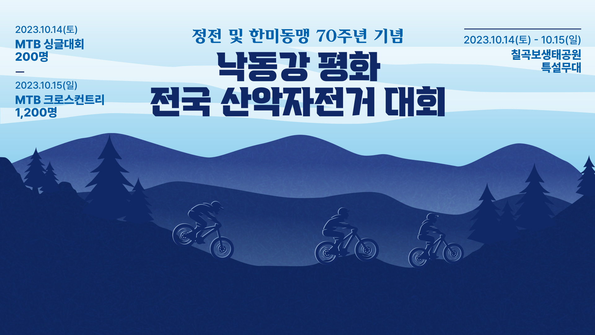
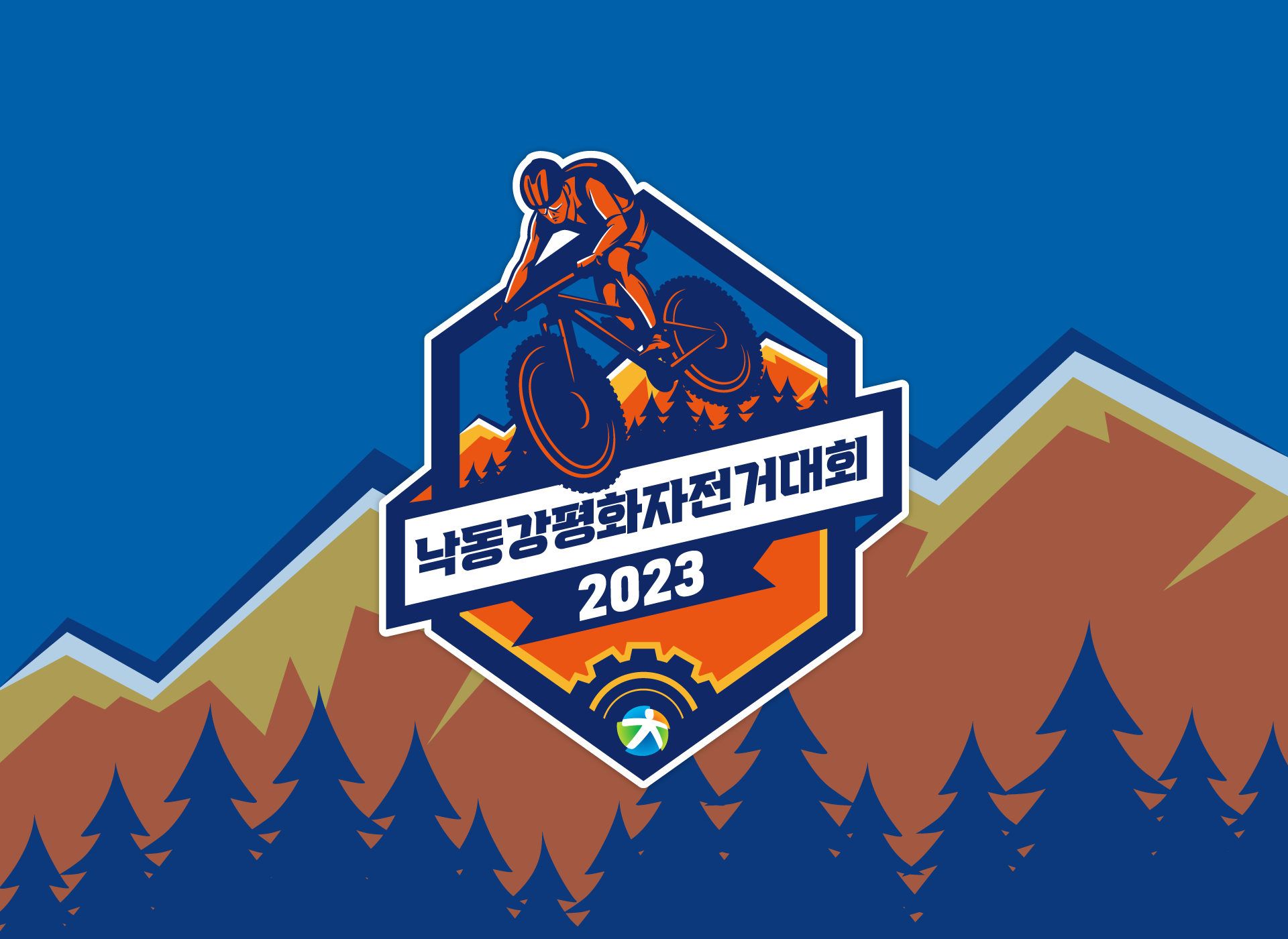
평화를 연상시키는 블루 컬러와 악센트 컬러인 오렌지 컬러 대비시켜 MTB 자전거 대회의 스포츠 정신을 함께 표현하였습니다.
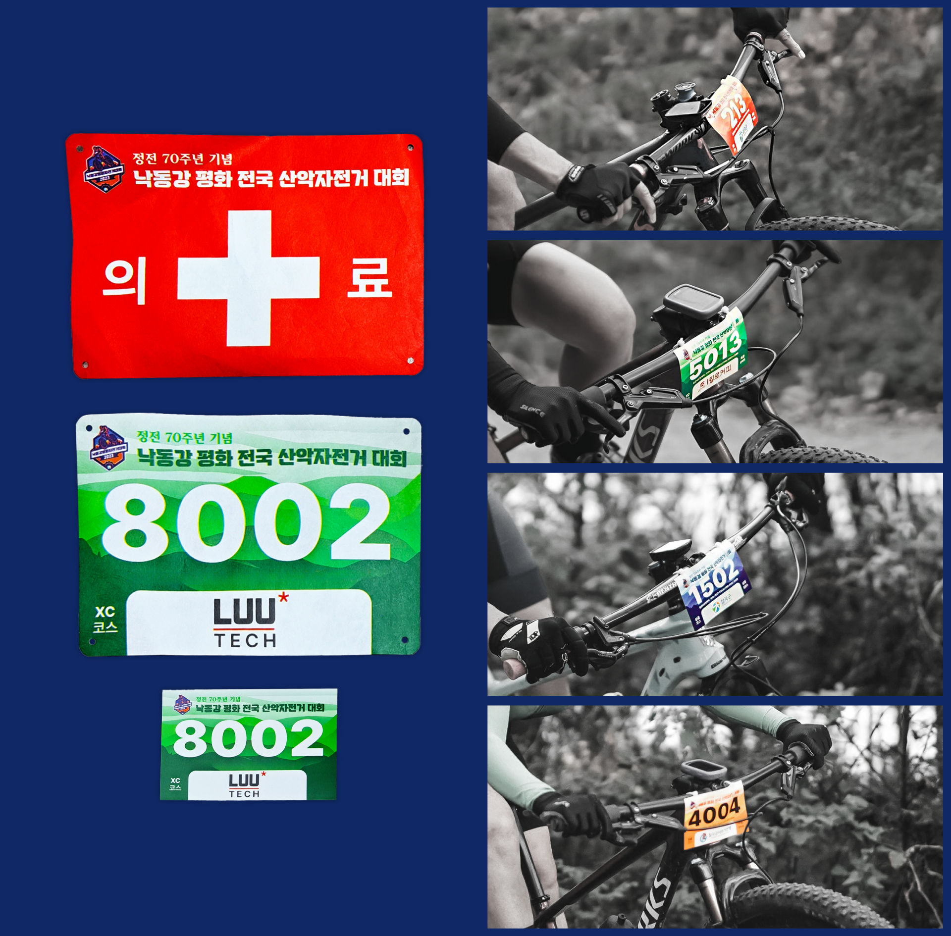
MTB 싱글대회와 MTB 크로스 컨트리 두 가지의 대회가 이틀간 진행하는 이벤트로 그만큼 종목이 나뉘어진만큼 더 직관적이고 대회의 원활한 진행을 위해 비비드한 원색 컬러로 가시성을 높혀 배번카드의 구분을 하였습니다.
This project covers the holistic design for the Nakdong River Peace National Mountain Bike Race, which was held to commemorate the end of the Korean War and the 70th anniversary of the U.S.-ROK alliance.
The blue color, reminiscent of peace, was contrasted with the accent color orange to express the sporting spirit of the MTB bicycle competition.
As the event is a two-day event with MTB single and MTB cross-country events, we used vivid primary colors to differentiate the bib cards to make them more intuitive and facilitate the smooth running of the event.